Netflix Content Analysis Dashboard
Interactive data visualization exploring Netflix's vast repository of movies and series up to 2020

Project Overview
About This Project
This comprehensive Netflix dashboard provides an immersive exploration of the streaming giant's content evolution through data-driven insights. The visualization captures trends, patterns, and preferences across Netflix's vast library, offering a unique perspective on the platform's content strategy and audience engagement patterns.
Key Objectives
- Analyze content distribution patterns across different genres and time periods
- Visualize the growth trajectory of Netflix's original productions
- Identify trending content categories and audience preferences
- Provide actionable insights for content strategy optimization
Dashboard Features
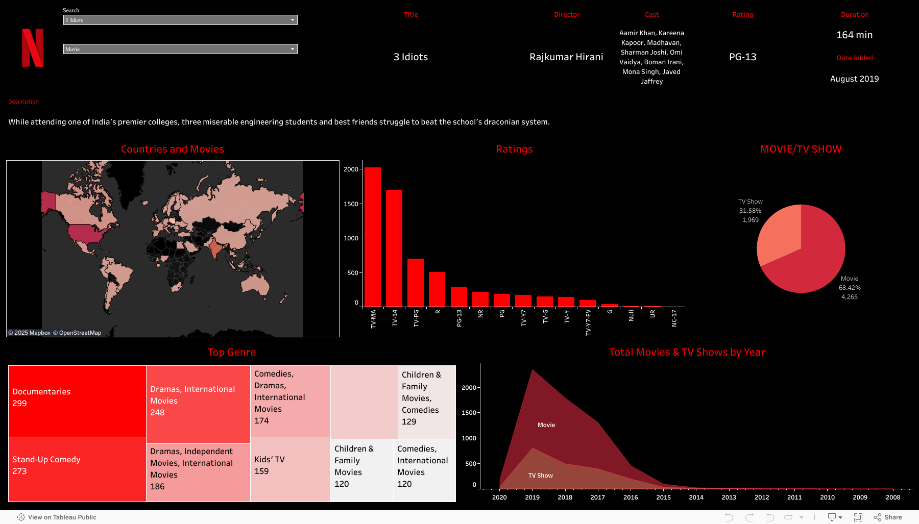
Content Distribution Analysis
Interactive charts showing the distribution of movies vs TV shows across different time periods and regions.
Global Content Mapping
Geographic visualization of content production and availability across 195 countries worldwide.
Genre Popularity Trends
Dynamic visualization of genre preferences and their evolution over time with interactive filtering.
Release Timeline
Comprehensive timeline view showing content release patterns and seasonal trends.
Technology Stack
Data Visualization
 Tableau
Data Processing
Analysis
Key Insights
Movies Dominate
Movies represent the majority of Netflix's content library, with TV shows making up the remaining 30%.
Peak Content Year
2018 marked the highest content addition year, reflecting Netflix's aggressive expansion strategy.
Top Producer
The United States leads in content production, followed by India and the United Kingdom.
Interactive Dashboard
Explore the live dashboard below or visit the full version for the best experience.
Ready to Explore More?
Check out my other projects or get in touch to discuss data visualization opportunities.